Internet Technologies
Tasks studies - laboratory
Project maintained by dawidolko Hosted on GitHub Pages — Theme by dawidolko
Forms
During the evolution of HTML, the ability to allow user interaction with a webpage was added. For this purpose, forms were created. The name is not accidental: the elements used to create them resemble those found in paper forms.
Sample Simple Form:
<!DOCTYPE html>
<html lang="pl">
  <head>
    <meta charset="UTF-8" />
    <title>Title</title>
  </head>
  <body>
    <form>
      <h1>Contact Form</h1>
      <label for="name">Enter your full name: </label>
      <input id="name" /> <br />
      <label for="mail">Enter your email address: </label>
      <input type="email" id="mail" name="email" /><br />
      <label for="content">Enter the message content:</label>
      <textarea id="content" name="content"></textarea>
      <br />
      <button>Send</button>
    </form>
  </body>
</html>
A form is denoted by the <form> tag. A page may contain several forms at once, each functioning independently. The button element, as a child of form, by default is used to submit the form data to the server. Historically, the only way to process form data was to specify in the action attribute a URL that referenced a server capable of handling the request. Essentially, the second method of working with forms is processing them on the client side using JavaScript, in which case there is usually no need to use the action attribute. The label element simply represents the label for a given form element; additionally, using the for attribute we can specify exactly which element (by providing its id) the label corresponds to. Browsers use this information in various situations (for example, clicking or touching a label moves focus to the associated input element; screen readers also benefit from this). It is also possible to omit the for attribute if the input is a child element of the label.
In the following example, the input element has a name attribute, which on the one hand names the form field and on the other is essential because elements without this attribute will not be submitted to the server. The type attribute allows us to specify what kind of input the element should accept; in this case, it is set to number, so it will not allow non-numeric characters (taking decimal separators as well as the - or + sign into account). In addition, a min attribute is set to establish the minimum value for the field. The output element is never sent to the server; its role is only to display some already processed value. The value attribute sets the initial value of an element (without it, the element appears empty or unfilled); when used together with type="radio", type="checkbox", or type="hidden", this attribute is considered mandatory because its value will be submitted to the server.
Because JavaScript has not yet been introduced at this stage of the lab, the following form will not actually convert the length from centimeters to inches. It only shows how to define such a form in HTML.
<form>
  <label>Enter length in cm: </label>
  <input name="length" type="number" min="0" value="1" id="length" /><br />
  <label>Length in inches: </label><output for="length">2.54</output>
  <button>do something</button>
</form>
Important Input Attributes:
- autofocus – allows us to choose which form field should be active when the page loads. Only one element in a form may have this attribute.
- placeholder – provides a hint as to what content should be entered into a field; it disappears once the user begins editing.
- autocomplete – instructs the browser to attempt to automatically fill in the field (applies to information such as address, phone number, email, etc.).
- required – indicates that the field must be filled in.
- disabled – prevents user interaction with the element, although it can have a default value.
- name – defines the key under which the field’s value will be submitted. When defining the value of this attribute, it is recommended not to use non-English characters!
Any software that parses and renders HTML (here the term “user agent” is used, meaning a class broader than just browsers) is not obligated to display HTML documents in a specified manner—the presentation layer is now handled by CSS.
The HTML Living Standard documentation link provides a set of recommendations regarding the rendering of HTML documents, and adherence to these is most likely in line with the developers’ intentions.
This applies to many form elements; however, the word “must” is not used regarding how the tags are displayed. Instead, the term “expected” is used to indicate the behavior that will achieve the intended effect. The documentation’s recommendations generally assume that the output medium has a resolution of at least 96 ppi. Presentation suggestions are mainly expressed in CSS terms, and it is expected that user agents will support CSS or adapt these suggestions to other presentation mechanisms. However, one cannot ignore the fact that in the past, form elements were rendered in a specific way without CSS, and for backward compatibility, it is maintained that unstyled form elements display in a “default” manner (though dependent on the specific browser).
Task 1.
Create a document called kontakt.html in which you will create a form containing: full name, phone number, email address (use the appropriate type attribute), message content (use a <textarea> element along with the rows and cols attributes). Remember to correctly define the label elements and set the for attribute as well as placeholders.
Task 2.
To the <form> tag from Task 1, add the attribute action="" and also add the attribute method="get" (this is the default value, but it is useful to learn about it). Setting action="" will cause the form to be submitted to itself—this is used here because no server has been written to process this form, but it can also be used to ensure that the form has no side effects. Usually, a URL (relative or absolute) of the server that will process the form data is provided here.
Read the documentation for the <button> element:
Then add two buttons to the form:
- A submit button, whose real role would be to send the form data to a traditional server (e.g., one programmed in PHP, Python, Java, etc.).
- A reset button, whose role is to reset the form elements to their initial state (e.g., clearing text fields, resetting checkboxes); currently, it is not recommended to use this button, especially if it might be confused with the submit button.
1.
Test the operation of both buttons. Explain what happens when the first button is clicked (observe the URL in the browser as well).
2.
Change the value of the method attribute to post and press the first button again. Explain the form’s behavior this time.
3.
Press the F12 key (on a laptop, Fn + F12) and open the following tab:
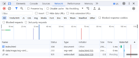
4.
Then submit the form again, with both method=”get” and method=”post”. Observe the generated HTTP requests and describe how they differ (based on the headers and payload tabs). The post method will not be properly processed (because the server is not expecting the form to be submitted to that URL) and you will receive an error message; however, you can still observe how the HTTP request is sent.
5.*
To better understand the operation of the post method, create the following file in Python (ensure that a Python interpreter is installed) and save it as app.py:
from flask import Flask, request

app = Flask(__name__)

@app.route("/", methods=['POST'])
def hello_world():
  return "I received email:" + request.form['email'] + ' and content: ' + request.form['content']
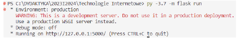
Run the following commands in a terminal:
pip install flask
flask run
Or
python -m flask run
The terminal output should look approximately like this:
At the same time, set the action attribute to http://localhost:5000/ and ensure that the names of the corresponding form elements are email and content.
Knowing Python is not the most important aspect here; what matters is that you now have an active server capable of handling the form. Python was chosen because of its concise code and ease of server startup.
What is the result of the form’s operation now?
Task 3.
The <select> element represents an interactive control that offers a list of options defined using <option>. It is important to define a name attribute for the <select> element, which will be used as the key for the value sent by the form.
Within the <option> element, it is important to define the value attribute, which will be used as the value submitted by the form. The name and value values form a key-value pair that is sent as the selection in the form.
The options in the select list can be grouped using the <optgroup> element, where the label attribute will serve as the label for that group of options.
Multiple selection for the list can be enabled using the multiple attribute, along with the size attribute that takes a numerical value representing the number of options visible at once. In most browsers, multiple options can be selected by holding the ctrl key and clicking on the desired options.
<label for="contact-topic">Type of inquiry</label>
<select id="contact-topic" name="contact-topic" multiple size="2">
  <optgroup label="General Questions">
    <option value="offer1">Product Offer</option>
    <option value="contact1">Contact Customer Support</option>
  </optgroup>
  <optgroup label="Technical Inquiries">
    <option value="problem1">Technical Problem with the Website</option>
    <option disabled value="user1">User Report</option>
  </optgroup>
</select>
Expand the form with a drop-down list from which one can choose 20 cities in Poland. Group the cities by province. Only one city can be selected. The last two cities in the list should be disabled (not selectable).
Task 4.
An <input> element with its type set to checkbox can have two basic states: checked and unchecked. There is a third state, “indeterminate,” which is used for controlling a group of checkboxes. This state indicates that at least one, but not all, available options have been selected and it can only be set via JavaScript.
In the context of checkboxes, the following attributes are important:
- checked – the presence of this attribute makes the checkbox checked by default.
- value – the value that will be submitted to the server if the checkbox is checked after the form is submitted.
Checkboxes should be used when you want to allow the selection of multiple options simultaneously (for example, filtering results by specifying the brands you are interested in). In principle, it is acceptable for none of the checkboxes in a form to be selected.
<label>
  <input type="checkbox" name="choice1" value="option1" /> Option 1 </label
><br />
<label>
  <input type="checkbox" name="choice2" value="option2" /> Option 2 </label
><br />
<label>
  <input type="checkbox" name="choice3" value="option3" /> Option 3 </label
><br />
<label>
  <input type="checkbox" name="choice4" value="option4" /> Option 4 </label
><br />
<label>
  <input type="checkbox" name="choice5" value="option5" /> Option 5
</label>
Create the following selection fields in the form:
-
“I accept the website’s terms and conditions”
- This field should be checked by default and not allow unchecking. It is required.
-
“Subscribe to the newsletter”
Task 5.
Another type of <input> element is radio. It allows the creation of a group of radio buttons from which only one option can be selected. The same name attribute value creates a group, from which only one option can be chosen; changing the selection automatically unchecks the previously selected option. It is important to add the value attribute whose value will be submitted to the server. Technically, it is possible that the form is constructed in such a way that no option is selected.
<label> <input type="radio" name="choice" value="option1" /> Option 1 </label
><br />
<label> <input type="radio" name="choice" value="option2" /> Option 2 </label
><br />
<label> <input type="radio" name="choice" value="option3" /> Option 3 </label
><br />
<label> <input type="radio" name="choice" value="option4" /> Option 4 </label
><br />
<label> <input type="radio" name="choice" value="option5" /> Option 5 </label>
Create in the form a group of radio buttons responsible for choosing one of the following options:
- Report a technical problem
- Proposal for cooperation
- Questions about content
- Report abuse
Task 6.
The <fieldset> tag is used to group several form elements into thematic groups. The <legend> tag inside the <fieldset> defines the caption for that group of interactive elements. Browsers usually automatically outline this element, although its appearance should be defined using CSS.
Group the form elements by category:
- Consent for data processing
- Reason for inquiry
- User information
Task 7.
Familiarize yourself with the remaining types of input:
Then, in the current document, create a section for creating an account on the website. In this section, include a form that utilizes the tags you have learned earlier and additionally includes:
- date (date of birth)
- file (image – avatar)
- password (account password)
- color (preferred theme color)
Then create a section where a train ticket can be purchased. In the form, use:
- date (departure date)
- time (departure time)
- search (city search)
- range (number of tickets from 1 up to a maximum of 10)
Task 8.
In order to reduce the possibility of submitting incorrect data to the server, validation (checking the correctness of the form data) is used. It can (and should) be performed on both the client and the server side.
Some form elements automatically add validation rules (e.g., the email type requires the presence of an “@” character). Validation requirements are added using attributes. The most complex, yet general, requirements for a field can be achieved using the pattern attribute.
link
Using the documentation available at link (also see the validation tabs for each input type), establish the following requirements:
- The full name field should allow the entry of a first and last name without digits or special characters. At least 4 characters must be entered.
- The phone number field is required and accepts only phone numbers in the format +XX XXX XXX XXX where X is a digit (0–9).
- The message content must contain at least 20 characters.
- Only PDF files can be attached.
- It should not be possible to select a date earlier than today and later than 3 months from now (used, for example, for purchasing public transportation tickets).
- The quantity must be greater than 0 and must not be a decimal fraction.
Test the operation of the defined validation rules. When attempting to submit the form by pressing a button with type=submit, the browser should display popups describing the reason for any validation error.
Check whether, after successful submission, all the values selected earlier in the form appear in the URL, and that their names are defined in a way that clarifies what each value represents.
Task 9.
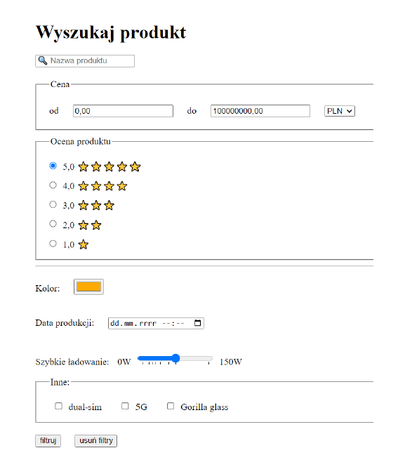
Replicate the form presented below. Remember to set all necessary attributes: id, for, value, name.
Use the following graphical symbols (they may render differently depending on the font or context, but they are UTF characters):

In the Google Chrome browser, install the extension: link and ensure that it is active.
Then click on the created elements. What benefits arise from setting attributes and labels? Compare the screen reader behavior on a form that lacks labels and the value attributes in checkboxes, radio buttons, or options.