Internet Technologies
Tasks studies - laboratory
Project maintained by dawidolko Hosted on GitHub Pages — Theme by dawidolko
Content Positioning, CSS Units, At-Rules, CSS Functions
1. CSS Units
| Unit | Description |
|---|---|
| px | Pixel – with appropriate scaling and device properties, 1px corresponds to a physical screen pixel. On very high-resolution displays (2K, 4K), scaling is applied so that 1px may be rendered as 2, 4, or more physical pixels (i.e. a multiple thereof). |
| em | 1em represents the current font size of the parent element. By default, the font size is 16 pixels, so 1em will equal 16 CSS pixels in most cases. It is recommended to use this unit when defining font sizes because it respects user preferences. Visually impaired users may use scaling or larger font sizes, and the em unit provides text sizes that adapt to these preferences while remaining compatible with other guidelines. However, changing the font size of an element will, of course, change the value of 1em. |
| rem | 1rem represents the font size of the root element (i.e. the HTML element). It differs from em in that it does not take the parent element’s font size into account, but rather uses the root element’s font size directly. |
| % | The percentage unit (%) in CSS is a relative unit of measurement that defines a value as a percentage of a base value. It is widely used to specify the size of elements relative to their container or other base values. |
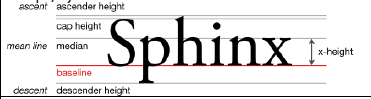
| ex | The “ex” unit in CSS is a relative unit based on the x-height of the current font. It is used to size elements relative to the height of the lowercase “x” in the current font system. It is assumed that one “ex” is roughly half the height of the font’s letter (by default around 8px – half of 16px). |
 |
|
| pt | Typographic points (“points”) – an absolute unit equal to 1/72 of an inch. |
| cm | Centimeters. |
| mm | Millimeters. |
| in | Inches. |
| pc | Pica – 12 typographic points (pt) or 1/6 of an inch. |
In practice, the most commonly used units in web development are px, em, rem, %, and ex. The use of the other units is not recommended for creating webpages – those units are primarily intended for print (i.e. printing a page on a printer).
CSS allows you to use traditional measuring units: centimeters and inches. In addition, you can use typographic units such as typographic points (“points”, pt) and picas (pc). However, it should be noted that whereas in the past these units accurately reproduced their traditional measurements on-screen (up until about 2011), this is no longer necessarily the case. This depends on the exact display device you have. The situation became more complicated with the advent of mobile devices using touchscreens. Today, only when printing CSS-styled documents will traditional measuring units be faithfully reproduced; a similar situation applies to “very high resolution” displays, although the CSS standard does not precisely define what that means (for example, by explicitly stating a threshold in ppi). In CSS, using these traditional units (cm, in, pt, pc) may not always reflect true sizes across different devices due to various factors such as screen resolution and page scaling.
In the past, CRT screens with a rather standardized ppi (pixels per inch) of 96 were dominant, so the CSS standard assumed that one inch divided into 96 pixels, 72 points, and 6 picas. At that time, a CSS pixel was equivalent to a physical pixel on the device. Nowadays, screens come with widely varying ppi, and assumptions such as “96 physical pixels equals 1 inch” have become obsolete. In principle, the relationships between the units still hold, but they have become completely abstract. In other words, when we think of inches or points, we mean CSS inches or CSS points, which are independent of their metric counterparts. Moreover, designing user interfaces with fixed measurement units encounters technical challenges: for example, 1cm on a smartphone screen may visually occupy much more space than on a traditional monitor. Also note that different device types are generally viewed from different distances (smartphones are typically held closer to the eyes than monitors), which also significantly affects how a website is perceived.
In practice, the browser calculates how many physical pixels will represent one CSS pixel (taking into account the actual size of the device, the “typical” viewing distance of that device, and other factors such as page zoom).
More about this can be read here:
link
link
2. At-Rules (“at rules”)
In addition to selectors, CSS provides what are known as at-rules, which begin with the @ symbol (read as “at”). These rules generally contain metadata for the stylesheets themselves rather than being directly used to style HTML elements, and they also allow a form of conditional instructions.
Simple examples of at-rules:
@charset "UTF-8"; /* sets the character encoding of the stylesheet */
@import "custom.css"; /* imports an external stylesheet */
2.1. Media Query
A commonly used at-rule is the media query, which allows you to adapt CSS styles based on the characteristics of the end device.
The syntax of a media query is as follows:
@media media-type and (media-feature-rule) {
  /* CSS rules go here */
}
Where media-type can be: all, print, screen and the media-feature-rule supports more cases.
link
When writing media queries, logical operators such as and, or, and not can be used.
Examples of media queries:
@media print { /* CSS rules below will only apply when printing */
  * {
    padding: 10px;
  }
}
@media screen { /* CSS rules below will only apply on screens */
  * {
    padding: 20px;
  }
}
@media screen and (max-width: 700px) {
  button {
    padding: 10px;
    max-width: 100px;
  }
}
@media screen and (min-width: 701px) and (max-width: 1200px) {
  button {
    padding: 20px;
    max-width: 150px;
  }
}
button {
  background-color: #f2f2f2;
  color: #3b3b3b;
}
2.2. @layer
This at-rule allows you to add your own layers in the CSS cascade.
<!DOCTYPE html>
<html>
<head>
  <meta charset="UTF-8" />
  <title>title</title>
  <style>
    @layer first, second;
    @layer first { p { color: red; } }
    @layer second { p { color: blue; border: 1px solid; } }
  </style>
</head>
<body>
  <p>This paragraph will have blue text and a border because the second layer overrides the first.</p>
</body>
</html>
One of its uses is to more easily manage specificity. In complex stylesheets there sometimes was a need to add unnecessary IDs or classes solely to increase specificity enough to override other styles.
3. Functions (Property Functions) in CSS
CSS allows the use of functions that dynamically compute (or set) the value of a property. Essentially, you cannot create your own functions, only use those provided by the CSS standard.
Basic syntax:
selector {
  property: function(argument1, argument2, …);
}
Examples:
background: rgb(31, 120, 50);
transform: translate(42px, 18px);
transform: rotate(90deg);
transform: scale(1.3, 0.4);
width: calc(2em * 5);
filter: blur(4px);
background-image: url("star.gif");
list-style-image: url('../images/bullet.jpg');
width: min(50vw, 200px);
4. Vendor Prefixes
During the evolution of CSS, experimental CSS properties were added to browsers that were marked with vendor prefixes. Nowadays, properties proposed by the W3C are sometimes added in this way before they are officially adopted into the standard. In the past, these prefixes were more significant since sometimes only one vendor supported a given property, making it unique to that browser.
The most well-known prefixes (in practice, the first two are becoming the only useful ones) are:
| Prefix | Browsers |
|---|---|
| -webkit- | Chromium, Chrome, Safari, iOS (built-in browser), Android (built-in browser), newer versions of Edge and Opera |
| -moz- | (Mozilla) Firefox |
| -o- | Legacy, outdated versions of Opera |
| -ms- | Internet Explorer and older versions of Edge |
5. The position Property
The CSS position property is used to determine how HTML elements are positioned on the page. It changes the way an element is laid out relative to other elements.
The position property has several values:
- static: The default value. Elements with static positioning are laid out according to the normal document flow, and their position is not altered by other positioning properties. The properties top, bottom, left, right, and z-index have no effect.
- relative: Positions the element relative to its original position in the document flow. You can use top, bottom, left, and right to shift the element from its original position.
- absolute: The element is positioned relative to the nearest ancestor element that is not static, or relative to the entire page if no such element exists.
- fixed: Similar to absolute, but the element is fixed relative to the browser window. It does not move when the page is scrolled.
- sticky: The element behaves as relative until a certain scroll position is reached, after which it becomes fixed.
After defining the position property along with top, left, right, bottom, and z-index, you can precisely determine the exact position of an HTML element.
- top: Specifies the distance from the top edge of the containing element when position is absolute, fixed, or sticky. For position: relative, top moves the element relative to its original position.
- bottom: Specifies the distance from the bottom edge of the containing element when position is absolute, fixed, or sticky. For position: relative, bottom moves the element relative to its original position.
- left: Specifies the distance from the left edge of the containing element when position is absolute, fixed, or sticky. For position: relative, left moves the element relative to its original position.
- right: Specifies the distance from the right edge of the containing element when position is absolute, fixed, or sticky. For position: relative, right moves the element relative to its original position.
Example:
div {
  position: relative;
  top: 100px;
  left: 100px;
}
6. The float Property
The CSS float property is used to specify how an element should “float” (wrap) around other elements. Its primary use is for text wrapping and creating multi-column layouts (although it was never originally designed for page layout and is now generally superseded by grid and flexbox for that purpose).
It is worth noting that in the past float was used for creating entire page layouts. This practice is now outdated and should not be used for that purpose. However, using float for wrapping text around images is still acceptable.
Main values for the float property:
- left: Causes the element to float to the left, with text and subsequent elements arranged to its right.
- right: Causes the element to float to the right, with text and subsequent elements arranged to its left.
The CSS clear property is used to control the behavior of elements that follow floated elements; clear specifies on which side an element should no longer allow floated elements to appear beside it.
Available values for clear:
- none: The element does not clear any floated elements.
- left: The element moves down until there is no floated element on the left.
- right: The element moves down until there is no floated element on the right.
- both: The element will move down until no floated elements appear on either the left or the right.
Task 1.
Copy the following document:
<!DOCTYPE html>
<html lang="en">
  <head>
    <meta charset="UTF-8" />
    <meta name="viewport" content="width=device-width, initial-scale=1.0" />
    <title>Document</title>
    <link rel="stylesheet" href="units.css" />
  </head>
  <body>
    <div class="cm">cm</div>
    <div class="mms">10 mm</div>
    <div class="inchascm">2.54cm</div>
    <div class="inchasmm">25.4mm</div>
    <div class="inch">inch</div>
    <div class="pxs96">96pxs</div>
    <div class="pts72">72pts</div>
    <div class="pcs6">6pcs</div>
  </body>
</html>
Along with its stylesheet:
.cm {
  width: 1cm;
  height: 1cm;
  background-color: blanchedalmond;
}
.inchascm {
  width: 2.54cm;
  height: 2.54cm;
  background-color: aqua;
}
.inchasmm {
  width: 25.4mm;
  height: 25.4mm;
  background-color: antiquewhite;
}
.mms {
  width: 10mm;
  height: 10mm;
  background-color: aliceblue;
}
.inch {
  width: 1in;
  height: 1in;
  background-color: aquamarine;
}
.pxs96 {
  width: 96px;
  height: 96px;
  background-color: azure;
}
.pts72 {
  width: 72pt;
  height: 72pt;
  background-color: beige;
}
.pcs6 {
  width: 6pc;
  height: 6pc;
  background-color: bisque;
}
-
What can you say about the relationships between the units in CSS?
-
Add to the stylesheet a media query of type print where you set for all HTML elements the property print-color-adjust to exact. Note that not all browsers support this property without a prefix.
link -
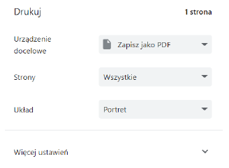
Print the page (using Ctrl+P is fastest) with your browser and save it as a PDF.
If you had not used “exact”, the browser would remove the background colors. -
- Using the ruler in your PDF viewer, you can check the length of 1cm and 1 inch (i.e. verify if it corresponds to the metric unit).
-
- If you have a ruler, you can also check the length of 1cm and 1 inch as displayed on the screen.
Task 2.
Copy the following HTML document:
<!DOCTYPE html>
<html>
  <head>
    <meta charset="UTF-8" />
    <title>title</title>
    <style>
      .parent {
        font-size: 16px;
      }
      .child-one {
        font-size: 1.5em;
      }
      .child-two {
        font-size: 1.5em;
      }
      .child-three {
        font-size: 2em;
      }
    </style>
  </head>
  <body>
    <div class="parent">
      <div class="child-one">1</div>
      <div class="child-two">2</div>
      <div class="child-three">3</div>
    </div>
  </body>
</html>
-
Change the font size in the
.parentclass to 20px. What effect did this have? -
Add another
divelement as a child of the parent div and set its width to 5em and add a border. Using developer tools, observe the element’s size. -
Move the div created in step 2 so that it becomes a child of the element with class
"child-one". What is its size in pixels now? -
Then move that element as a child of the element with class
"child-three". What is its size in pixels now? -
Change all the em units to rem units. How do the elements behave in the situations from steps 2–4 now?
-
Add a rule that sets the font-size of the html element to 24px; also add the text “parent” to the div with class
"parent". What is the effect?
Task 3.
Create the following menu bar.

To create the arrows, use the pseudo-element ::after in which:
- Set the content property to an empty string.
- Set the border property so that the border is 10px wide and transparent.
- Use the border-top property in white to create an arrow pointing in the appropriate direction.
- Using the position property along with top and left, set the location of the element.
Task 4.
Enhance the menu so that when hovering over an item, the following options appear, and when the cursor is removed they disappear.
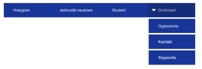
The elements forming the submenu can be displayed as block-level elements and initially have their opacity set to 0. On hover, the elements change their opacity to 1.
Task 5.
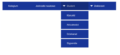
Modify the CSS rules so that, in the simplest way possible, you can create a menu consisting of successive dropdown menus. Reduce the number of CSS rules as much as possible.
Task 6.
Create an option to add another dropdown menu either on the left or right side, in green.
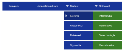
Review the documentation:
Then add the appropriate properties so that invisible elements do not block selection of the “Informatyka” option in the created menu. Without these properties, the current menu may display an option from the “Doktorant” menu when hovering over “Informatyka.”
Task 7.
Using the documentation:
-
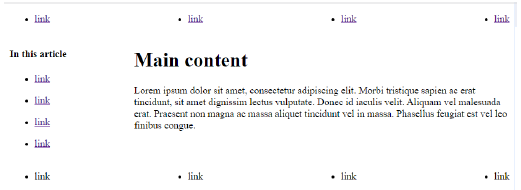
Reproduce the following content layout:
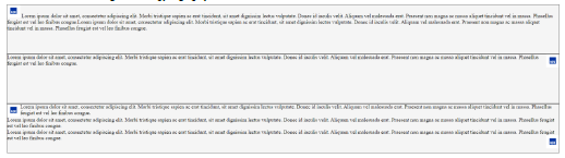
For clarification: an
<article>element is used, containing<section>elements. The<section>elements have a border and a background color of whitesmoke. The image size is set to 40x40px. The<section>elements have a height of 150px.
The lorem ipsum text used in the example:Lorem ipsum dolor sit amet, consectetur adipiscing elit, sed do eiusmod tempor incididunt ut labore et dolore magna aliqua. Ut enim ad minim veniam, quis nostrud exercitation ullamco laboris nisi ut aliquip ex ea commodo consequat. Duis aute irure dolor in reprehenderit in voluptate velit esse cillum dolore eu fugiat nulla pariatur. Excepteur sint occaecat cupidatat non proident, sunt in culpa qui officia deserunt mollit anim id est laborum. -
Next, try to achieve a three-column layout using float. To do this, add
float: left;andwidth: 33%;to the<section>elements. What is the effect? -
Does removing
height: 150pxsolve the problem? -
To demonstrate that there is a much better way to achieve this effect than using float, remove
float: left;andwidth: 33%;from the<section>elements, and instead adddisplay: flex;to the<article>element. The effect should be as follows: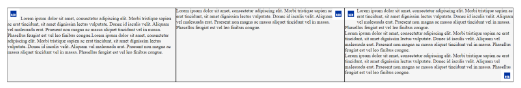
(Due to the complexity of flex, it will be explained in a subsequent lesson; here it serves primarily as a demonstration.)
Task 8.
Using media queries:
- Set a layout for large screens (conventionally, screens wider than 768px)
- Set a layout for small screens (conventionally, screens narrower than 768px)
Task 9.
Using @layer, create three CSS layers: first, second, and third; assign them in the same order. Set the text color for the <section> element in each layer to black, red, and blue respectively. Then create a valid HTML document with a <section> element.
- Which text color is active? Do you know why?
- Outside of the layers, set the text color for
<section>to green. Open the developer tools and check the order of the styling rules. - Create an external stylesheet named
external.css, in which you create a layer named zero that sets the<section>text color to brown. Import this stylesheet into the current document using@import. Let it be the first instruction in the CSS. What default order did the zero layer assume? - This time, move the layer declaration (with the order) before the
@importand set the zero layer as the most important. - In the first layer, add
!importantto the color value. - In
external.css, outside the zero layer, set the<section>color to yellow. Which definition in the cascade hierarchy takes precedence?
Task 10.
For the <section> element from the previous task, sequentially:
- Rotate it by 10 degrees.
- Scale it by 200%.
- Apply a blur filter.
- Set its text color to semi-transparent blue.
- Set its padding to a value calculated as 1em minus 5px.
Use CSS functions.