Internet Technologies
Tasks studies - laboratory
Project maintained by dawidolko Hosted on GitHub Pages — Theme by dawidolko
Page Layout Using Flexbox and Grid, Introduction to RWD
One of CSS’s longstanding challenges since its inception was how to lay out a page’s content. While CSS works well for setting colors, fonts, borders, etc., it began to prove insufficient for designing more complex page layouts (it is also worth noting that originally it was assumed that HTML documents would simply be read from top to bottom, following roughly the standard flow pattern). The original CSS was not designed for flexibility in adapting to the capabilities of the device (mainly its screen), that is, for what is now known as Responsive Web Design (RWD).
Earlier solutions—based on arranging content using tables [sic!], floats (i.e. using the float property), or even frames (which were later removed from the HTML standard)—proved inadequate, and in some cases even conflicted with HTML’s own goals (i.e. the semantic meaning of elements). Similarly, the position property was insufficient to address all the problems that arise when laying out content.
Flexbox
The flexible box layout (Flexbox) allows you to arrange elements along a single axis (either horizontally—in rows—or vertically—in columns). An important feature of this layout method is that it automatically adjusts the sizes of its child elements to achieve the desired result. It is worth noting that flexbox layouts can be nested within one another. A summary of its capabilities can be found here:
link.
Grid
CSS Grid allows you to arrange elements in two dimensions (i.e. by defining their placement in rows and columns). This means it offers more possibilities than flexbox in this regard. The name is not accidental and refers to a grid system for content layout. The grid system also flexibly adapts elements to the designed layout, and grids can be nested. A common pattern is to first use grid for the overall layout, then use flexbox at a lower level.
Both flexbox and grid became widely used (and supported) around 2015. The history of layout development and comparisons of various methods can be found here:
link.
It is also worth noting that today all major browsers support both flexbox and grid. This is therefore a solution “built into” CSS—something that cannot be said for some CSS frameworks (e.g., Twitter Bootstrap, which in later versions also uses grid and flexbox in its implementations).
Viewport
The viewport is the area that the browser has available to render a page. Essentially, by resizing the window you dynamically change the viewport size (mainly on desktop devices, although mobile devices today also offer various options such as “floating” windows or split-screen modes).
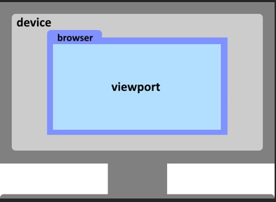
In some situations, to ensure that a given element occupies a certain portion of the available viewport, new units were introduced:
| vw | vh |
|---|---|
| Stands for viewport width, where 1vw is equal to 1% of the viewport’s width. | Stands for viewport height, where 1vh is equal to 1% of the viewport’s height. |
As you can see, these units are independent of numeric values such as pixels; they are different from the simple percentage unit (which is relative to the parent’s size). If you were to use %, you would have to somehow force, for example, the body element to occupy the entire viewport and then base all other elements on that – which in practice was neither simple nor convenient. On mobile devices, this issue became even more complicated due to the appearance of the virtual keyboard that forces the browser to resize. More information can be found here:
link.
At the same time, it should be added that these two units have also proven insufficient in practice, especially for mobile devices. More details can be read here:
link, link, link.
Task 1.
To interactively explore the capabilities of Flexbox, run the following web application:
link
and complete all the tasks. You may refer to the guide:
link.
Task 2.
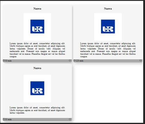
For the following HTML document, add styles to achieve the effect shown in the image below:
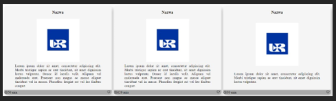
Use the following properties: flex-direction, gap, align-items, justify-content, and flex. In this example, an external module that adds a set of ready-made icons is also used. In general, nest Flexbox layouts within individual elements. Notice that the last card, although it has less content, is aligned to be the same size as the other two cards; achieve the same effect.
<!DOCTYPE html>
<html>
  <head>
    <meta charset="UTF-8" />
    <title>title</title>
    <script
      type="module"
      src="https://unpkg.com/ionicons@7.1.0/dist/ionicons/ionicons.esm.js"></script>
  </head>
  <body>
    <div class="container">
      <div class="card">
        <h3>Name</h3>
        <img src="logo_UR_blue.jpg" alt="Logo" />
        <div class="main-text">
          Lorem ipsum dolor sit amet, consectetur adipiscing elit. Morbi
          tristique sapien ac erat tincidunt, sit amet dignissim lectus
          vulputate. Donec id iaculis velit. Aliquam vel malesuada erat.
          Praesent non magna ac massa aliquet tincidunt vel in massa. Phasellus
          feugiat est vel leo finibus congue.
        </div>
        <div class="bottom">
          <span><ion-icon name="time-outline"></ion-icon> 50 min</span>
          <button><ion-icon name="heart-outline"></ion-icon></button>
        </div>
      </div>
      <div class="card">
        <h3>Name</h3>
        <img src="logo_UR_blue.jpg" alt="Logo" />
        <div class="main-text">
          Lorem ipsum dolor sit amet, consectetur adipiscing elit. Morbi
          tristique sapien ac erat tincidunt, sit amet dignissim lectus
          vulputate. Donec id iaculis velit. Aliquam vel malesuada erat.
          Praesent non magna ac massa aliquet tincidunt vel in massa. Phasellus
          feugiat est vel leo finibus congue.
        </div>
        <div class="bottom">
          <span><ion-icon name="time-outline"></ion-icon> 120 min</span>
          <button><ion-icon name="heart-outline"></ion-icon></button>
        </div>
      </div>
      <div class="card">
        <h3>Name</h3>
        <img src="logo_UR_blue.jpg" alt="Logo" />
        <div class="main-text">
          Lorem ipsum dolor sit amet, consectetur adipiscing elit. Morbi
          tristique sapien ac erat tincidunt, sit amet dignissim lectus
          vulputate.
        </div>
        <div class="bottom">
          <span><ion-icon name="time-outline"></ion-icon> 30 min</span>
          <button><ion-icon name="heart-outline"></ion-icon></button>
        </div>
      </div>
    </div>
  </body>
</html>
Task 3.
For the example from Task 2:
- First, copy two more cards. What effect did that have?
- In the
.containerclass, setmax-width: 500pxand, in the.cardclass, setmin-width: 200px.
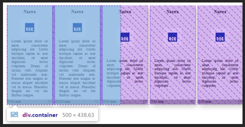
The result should be similar to the image above, i.e. the child elements overflow their parent.
- Now set in the
.containerclass:overflow-x: scroll. What effect does this produce? This solution is sometimes used in mobile layouts, even though for aesthetics the scrollbar is typically hidden. You can achieve this as follows:
.container::-webkit-scrollbar {
  display: none;
} /* most browsers */
.container {
  scrollbar-width: none; /* Firefox */
}
-
Now, in the
.containerclass, addflex-wrap: wrapand remove theoverflowproperty. If you have three cards (as originally), the following result is possible (depending on Flex properties):
This is because the last element takes up all the available space in the container. To prevent such a layout, you can use the following CSS properties in the.cardclass:
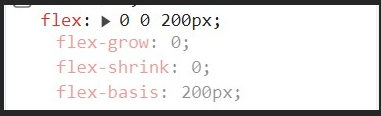
-
Propose an alternative solution to the problem above using
min-widthandmax-width, and also set a uniform height for the elements. An alternative solution using CSS Grid will also be shown later in this guide.
Task 4.
Copy the following example:
<!DOCTYPE html>
<html lang="en">
  <head>
    <meta charset="UTF-8" />
    <meta name="viewport" content="width=device-width, initial-scale=1.0" />
    <title>Flexbox intro</title>
  </head>
  <style>
    * {
      box-sizing: border-box;
    }
    .take-all-space {
      display: flex;
      flex-direction: column;
      justify-content: space-between;
      min-width: 100vw;
      min-height: 100vh;
      margin: 0;
    }
    .main-content {
      display: flex;
      flex-direction: row;
      flex-grow: 2;
      align-items: stretch;
    }
    .main-section {
      display: flex;
      flex-direction: column;
      align-items: center;
    }
    .main-section section {
      padding: 10px;
      max-width: 70%;
      text-align: center;
    }
    .navbar {
      background-color: #313131;
    }
    .navbar-links {
      display: flex;
      flex-direction: row;
      list-style-type: none;
      justify-content: space-evenly;
      padding: 0;
    }
    .navbar-links li a {
      color: #fff;
      text-decoration: none;
      padding: 5px;
    }
    .aside {
      background-color: #8e8c8c;
      min-width: 25%;
      display: flex;
      flex-direction: column;
      align-items: center;
      text-align: justify;
    }
    .aside ul {
      display: flex;
      flex-direction: column;
      list-style-type: none;
      justify-content: space-evenly;
      padding: 0;
    }
    .aside li a {
      color: #fff;
      text-decoration: none;
      padding: 5px;
    }
    .footer {
      background-color: #313131;
    }
    .footer-links {
      display: flex;
      flex-direction: row;
      list-style-type: none;
      justify-content: space-evenly;
      padding: 0;
    }
    .footer-links li a {
      color: #fff;
      text-decoration: none;
      padding: 5px;
    }
  </style>
  <body class="take-all-space">
    <nav class="navbar">
      <ul class="navbar-links">
        <li><a href="#">Home</a></li>
        <li><a href="#">Subpage 1</a></li>
        <li><a href="#">Subpage 2</a></li>
        <li><a href="#">Subpage 3</a></li>
      </ul>
    </nav>
    <div class="main-content">
      <aside class="aside">
        <h2>Site Map</h2>
        <ul>
          <li><a href="#">link1</a></li>
          <li><a href="#">link2</a></li>
          <li><a href="#">link3</a></li>
          <li><a href="#">link4</a></li>
        </ul>
      </aside>
      <div class="main-section">
        <h1>Home</h1>
        <section>
          Lorem ipsum dolor sit amet, consectetur adipiscing elit. Morbi
          tristique sapien ac erat tincidunt, sit amet dignissim lectus
          vulputate. Donec id iaculis velit. Aliquam vel malesuada erat.
          Praesent non magna ac massa aliquet tincidunt vel in massa. Phasellus
          feugiat est vel leo finibus congue. Lorem ipsum dolor sit amet,
          consectetur adipiscing elit. Morbi tristique sapien ac erat tincidunt,
          sit amet dignissim lectus vulputate. Donec id iaculis velit. Aliquam
          vel malesuada erat. Praesent non magna ac massa aliquet tincidunt vel
          in massa. Phasellus feugiat est vel leo finibus congue.
        </section>
      </div>
    </div>
    <footer class="footer">
      <ul class="footer-links">
        <li><a href="#">link1</a></li>
        <li><a href="#">link2</a></li>
        <li><a href="#">link3</a></li>
        <li><a href="#">link4</a></li>
      </ul>
    </footer>
  </body>
</html>
-
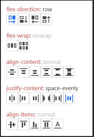
Open the developer tools and hover over the
<ul>element with classnavbar-links. Click the button:
Then explore the available Flex properties by clicking each option and observing its effect:
-
View the page on any smartphone (using developer tools). Evaluate the optimality of the applied layout on that device.
-
Next, using an appropriate media query, add styles more suitable for mobile devices. On mobile devices, toggle menus (i.e. menus based on a switch) are popular. The example below shows how to achieve such an effect using pure CSS (without JavaScript). This solution relies on a hidden checkbox (invisible to the user) with a visible label. Clicking the label toggles the checkbox, and using the
:checkedpseudo-class you can modify the appearance of elements (here, “collapsing/expanding” the menu links). Treat this as a hint for further work.
@media screen and (max-width: 400px) {
  .navbar {
    background-color: #313131;
    display: flex;
    align-items: baseline;
  }
  #toggle {
    display: none;
    border: 0;
  }
  .navbar label {
    color: white;
    background-color: #8e8c8c;
    min-width: 30px;
    text-align: center;
    margin: 5px;
    display: block;
  }
  .navbar-links {
    display: none;
  }
  #toggle:checked ~ .navbar-links {
    display: flex;
    flex-direction: column;
    list-style-type: none;
    justify-content: space-evenly;
    padding: 0;
  }
}
<nav class="navbar">
  <label for="toggle">☰</label>
  <input type="checkbox" id="toggle" />
  <ul class="navbar-links">
    <li><a href="#">Home</a></li>
    <li><a href="#">Subpage 1</a></li>
    <li><a href="#">Subpage 2</a></li>
    <li><a href="#">Subpage 3</a></li>
  </ul>
</nav>
PS: Outside the mobile media query, set:
#toggle {
  display: none;
}
.navbar label {
  display: none;
}
Task 5.
To interactively explore the capabilities of Grid, run the following web application:
link
and complete all the tasks. You may refer to the guide:
link
Task 6.
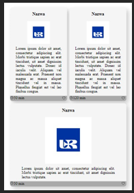
In the example from Task 2, replace the .container style with:
.container {
  display: grid;
  grid-template-columns: 50% 50%;
  grid-template-rows: auto;
  gap: 10px;
}
Do not set a min-width for the .card elements.
Example:
• Change the number of cards (from 1 to 10) and observe how the grid system adapts.
Task 7.
Review the guide at the link below. The most important aspect is the properties and explanation of how they work. On the left side are the properties applied to the “parent” and on the right those applied to the “child”.
link
Using the value “grid” for the display property, create styles for a responsive photo gallery for the following HTML document:
<!DOCTYPE html>
<html lang="en">
  <head>
    <meta charset="UTF-8" />
    <meta name="viewport" content="width=device-width, initial-scale=1.0" />
    <title>Grid example</title>
    <style>
      :root {
        --blue-ur: #0033a0;
        --white-ur: #fefefe;
      }
      body {
        text-align: center;
        color: var(--white-ur);
        background-color: var(--blue-ur);
      }
      img {
        background-color: var(--white-ur);
        width: 300px;
      }
    </style>
  </head>
  <body>
    <h1>Gallery</h1>
    <section id="gallery" class="gallery">
      <img src="placeholder.svg" alt="placeholder image" />
      <img src="placeholder.svg" alt="placeholder image" />
      <img src="placeholder.svg" alt="placeholder image" />
      <img src="placeholder.svg" alt="placeholder image" />
      <img src="placeholder.svg" alt="placeholder image" />
    </section>
  </body>
</html>
In this example, CSS variables (custom properties) are used. Instead of repeatedly defining the same values (colors, fonts, border-radius, etc.) in many places, you set them once and refer to them wherever needed. Formally, these are custom properties. If added to the :root pseudo-element, all elements will have access to them; note that this is not required if you wish to limit the scope.
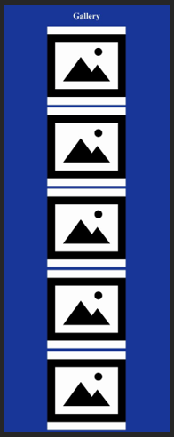
On screens smaller than 768px, the images should display in a single column with a width of 400px and a gap of 10px between rows and columns.
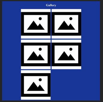
On screens smaller than 1200px, the images should display in two columns with a width of 400px and a 10px gap between rows and columns.
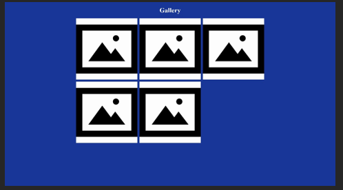
On screens larger than 1200px, the images should display in three columns with a width of 400px and a 10px gap between rows and columns.
Duplicate the <img> tag and check if the layout remains responsive.
Task 8.
Copy the following document, then using display: grid and flex, style the document so that it displays an academic year calendar with weeks A and B highlighted in two different colors. On desktop devices, the months for weeks A and B should be displayed side by side.
<!DOCTYPE html>
<html lang="en">
<head>
<meta charset="UTF-8" />
<meta name="viewport" content="width=device-width, initial-scale=1.0" />
<title>Calendar</title>
</head>
<body>
<article>
<h2>Week A</h2>
<section>
<h2>October 2023</h2>
<ul>
<li>Mon</li>
<li>Tue</li>
<li>Wed</li>
<li>Thu</li>
<li>Fri</li>
<li>Sat</li>
<li>Sun</li>
</ul>
<ol>
<li>1</li>
<li>2</li>
<li>3</li>
<li>4</li>
<li>5</li>
<li>6</li>
<li>7</li>
<li>8</li>
<li>9</li>
<li>10</li>
<li>11</li>
<li>12</li>
<li>13</li>
<li>14</li>
<li>15</li>
<li>16</li>
<li>17</li>
<li>18</li>
<li>19</li>
<li>20</li>
<li>21</li>
<li>22</li>
<li>23</li>
<li>24</li>
<li>25</li>
<li>26</li>
<li>27</li>
<li>28</li>
<li>29</li>
<li>30</li>
<li>31</li>
</ol>
</section>
<section>
<h2>November 2023</h2>
<ul>
<li>Mon</li>
<li>Tue</li>
<li>Wed</li>
<li>Thu</li>
<li>Fri</li>
<li>Sat</li>
<li>Sun</li>
</ul>
<ol>
<li>1</li>
<li>2</li>
<li>3</li>
<li>4</li>
<li>5</li>
<li>6</li>
<li>7</li>
<li>8</li>
<li>9</li>
<li>10</li>
<li>11</li>
<li>12</li>
<li>13</li>
<li>14</li>
<li>15</li>
<li>16</li>
<li>17</li>
<li>18</li>
<li>19</li>
<li>20</li>
<li>21</li>
<li>22</li>
<li>23</li>
<li>24</li>
<li>25</li>
<li>26</li>
<li>27</li>
<li>28</li>
<li>29</li>
<li>30</li>
<li>31</li>
</ol>
</section>
<section>
<h2>December 2023</h2>
<ul>
<li>Mon</li>
<li>Tue</li>
<li>Wed</li>
<li>Thu</li>
<li>Fri</li>
<li>Sat</li>
<li>Sun</li>
</ul>
<ol>
<li>1</li>
<li>2</li>
<li>3</li>
<li>4</li>
<li>5</li>
<li>6</li>
<li>7</li>
<li>8</li>
<li>9</li>
<li>10</li>
<li>11</li>
<li>12</li>
<li>13</li>
<li>14</li>
<li>15</li>
<li>16</li>
<li>17</li>
<li>18</li>
<li>19</li>
<li>20</li>
<li>21</li>
<li>22</li>
<li>23</li>
<li>24</li>
<li>25</li>
<li>26</li>
<li>27</li>
<li>28</li>
<li>29</li>
<li>30</li>
<li>31</li>
</ol>
</section>
</article>
<article>
<h2>Week B</h2>
<section>
<h2>October 2023</h2>
<ul>
<li>Mon</li>
<li>Tue</li>
<li>Wed</li>
<li>Thu</li>
<li>Fri</li>
<li>Sat</li>
<li>Sun</li>
</ul>
<ol>
<li>1</li>
<li>2</li>
<li>3</li>
<li>4</li>
<li>5</li>
<li>6</li>
<li>7</li>
<li>8</li>
<li>9</li>
<li>10</li>
<li>11</li>
<li>12</li>
<li>13</li>
<li>14</li>
<li>15</li>
<li>16</li>
<li>17</li>
<li>18</li>
<li>19</li>
<li>20</li>
<li>21</li>
<li>22</li>
<li>23</li>
<li>24</li>
<li>25</li>
<li>26</li>
<li>27</li>
<li>28</li>
<li>29</li>
<li>30</li>
<li>31</li>
</ol>
</section>
<section>
<h2>November 2023</h2>
<ul>
<li>Mon</li>
<li>Tue</li>
<li>Wed</li>
<li>Thu</li>
<li>Fri</li>
<li>Sat</li>
<li>Sun</li>
</ul>
<ol>
<li>1</li>
<li>2</li>
<li>3</li>
<li>4</li>
<li>5</li>
<li>6</li>
<li>7</li>
<li>8</li>
<li>9</li>
<li>10</li>
<li>11</li>
<li>12</li>
<li>13</li>
<li>14</li>
<li>15</li>
<li>16</li>
<li>17</li>
<li>18</li>
<li>19</li>
<li>20</li>
<li>21</li>
<li>22</li>
<li>23</li>
<li>24</li>
<li>25</li>
<li>26</li>
<li>27</li>
<li>28</li>
</ol>
</section>
<section>
<h2>December 2023</h2>
<ul>
<li>Mon</li>
<li>Tue</li>
<li>Wed</li>
<li>Thu</li>
<li>Fri</li>
<li>Sat</li>
<li>Sun</li>
</ul>
<ol>
<li>1</li>
<li>2</li>
<li>3</li>
<li>4</li>
<li>5</li>
<li>6</li>
<li>7</li>
<li>8</li>
<li>9</li>
<li>10</li>
<li>11</li>
<li>12</li>
<li>13</li>
<li>14</li>
<li>15</li>
<li>16</li>
<li>17</li>
<li>18</li>
<li>19</li>
<li>20</li>
<li>21</li>
<li>22</li>
<li>23</li>
<li>24</li>
<li>25</li>
<li>26</li>
<li>27</li>
<li>28</li>
<li>29</li>
<li>30</li>
<li>31</li>
</ol>
</section>
<section>
<h2>January 2024</h2>
<ul>
<li>Mon</li>
<li>Tue</li>
<li>Wed</li>
<li>Thu</li>
<li>Fri</li>
<li>Sat</li>
<li>Sun</li>
</ul>
<ol>
<li>1</li>
<li>2</li>
<li>3</li>
<li>4</li>
<li>5</li>
<li>6</li>
<li>7</li>
<li>8</li>
<li>9</li>
<li>10</li>
<li>11</li>
<li>12</li>
<li>13</li>
<li>14</li>
<li>15</li>
<li>16</li>
<li>17</li>
<li>18</li>
<li>19</li>
<li>20</li>
<li>21</li>
<li>22</li>
<li>23</li>
<li>24</li>
<li>25</li>
<li>26</li>
<li>27</li>
<li>28</li>
<li>29</li>
<li>30</li>
<li>31</li>
</ol>
</section>
<section>
<h2>February 2024</h2>
<ul>
<li>Mon</li>
<li>Tue</li>
<li>Wed</li>
<li>Thu</li>
<li>Fri</li>
<li>Sat</li>
<li>Sun</li>
</ul>
<ol>
<li>1</li>
<li>2</li>
<li>3</li>
<li>4</li>
<li>5</li>
<li>6</li>
<li>7</li>
<li>8</li>
<li>9</li>
<li>10</li>
<li>11</li>
<li>12</li>
<li>13</li>
<li>14</li>
<li>15</li>
<li>16</li>
<li>17</li>
<li>18</li>
<li>19</li>
<li>20</li>
<li>21</li>
<li>22</li>
<li>23</li>
<li>24</li>
<li>25</li>
<li>26</li>
<li>27</li>
<li>28</li>
</ol>
</section>
<section>
<h2>March 2024</h2>
<ul>
<li>Mon</li>
<li>Tue</li>
<li>Wed</li>
<li>Thu</li>
<li>Fri</li>
<li>Sat</li>
<li>Sun</li>
</ul>
<ol>
<li>1</li>
<li>2</li>
<li>3</li>
<li>4</li>
<li>5</li>
<li>6</li>
<li>7</li>
<li>8</li>
<li>9</li>
<li>10</li>
<li>11</li>
<li>12</li>
<li>13</li>
<li>14</li>
<li>15</li>
<li>16</li>
<li>17</li>
<li>18</li>
<li>19</li>
<li>20</li>
<li>21</li>
<li>22</li>
<li>23</li>
<li>24</li>
<li>25</li>
<li>26</li>
<li>27</li>
<li>28</li>
<li>29</li>
<li>30</li>
<li>31</li>
</ol>
</section>
<section>
<h2>April 2024</h2>
<ul>
<li>Mon</li>
<li>Tue</li>
<li>Wed</li>
<li>Thu</li>
<li>Fri</li>
<li>Sat</li>
<li>Sun</li>
</ul>
<ol>
<li>1</li>
<li>2</li>
<li>3</li>
<li>4</li>
<li>5</li>
<li>6</li>
<li>7</li>
<li>8</li>
<li>9</li>
<li>10</li>
<li>11</li>
<li>12</li>
<li>13</li>
<li>14</li>
<li>15</li>
<li>16</li>
<li>17</li>
<li>18</li>
<li>19</li>
<li>20</li>
<li>21</li>
<li>22</li>
<li>23</li>
<li>24</li>
<li>25</li>
<li>26</li>
<li>27</li>
<li>28</li>
<li>29</li>
<li>30</li>
</ol>
</section>
<section>
<h2>May 2024</h2>
<ul>
<li>Mon</li>
<li>Tue</li>
<li>Wed</li>
<li>Thu</li>
<li>Fri</li>
<li>Sat</li>
<li>Sun</li>
</ul>
<ol>
<li>1</li>
<li>2</li>
<li>3</li>
<li>4</li>
<li>5</li>
<li>6</li>
<li>7</li>
<li>8</li>
<li>9</li>
<li>10</li>
<li>11</li>
<li>12</li>
<li>13</li>
<li>14</li>
<li>15</li>
<li>16</li>
<li>17</li>
<li>18</li>
<li>19</li>
<li>20</li>
<li>21</li>
<li>22</li>
<li>23</li>
<li>24</li>
<li>25</li>
<li>26</li>
<li>27</li>
<li>28</li>
<li>29</li>
<li>30</li>
<li>31</li>
</ol>
</section>
<section>
<h2>June 2024</h2>
<ul>
<li>Mon</li>
<li>Tue</li>
<li>Wed</li>
<li>Thu</li>
<li>Fri</li>
<li>Sat</li>
<li>Sun</li>
</ul>
<ol>
<li>1</li>
<li>2</li>
<li>3</li>
<li>4</li>
<li>5</li>
<li>6</li>
<li>7</li>
<li>8</li>
<li>9</li>
<li>10</li>
<li>11</li>
<li>12</li>
<li>13</li>
<li>14</li>
<li>15</li>
<li>16</li>
<li>17</li>
<li>18</li>
<li>19</li>
<li>20</li>
<li>21</li>
<li>22</li>
<li>23</li>
<li>24</li>
<li>25</li>
<li>26</li>
<li>27</li>
<li>28</li>
<li>29</li>
<li>30</li>
</ol>
</section>
<section>
<h2>July 2024</h2>
<ul>
<li>Mon</li>
<li>Tue</li>
<li>Wed</li>
<li>Thu</li>
<li>Fri</li>
<li>Sat</li>
<li>Sun</li>
</ul>
<ol>
<li>1</li>
<li>2</li>
<li>3</li>
<li>4</li>
<li>5</li>
<li>6</li>
<li>7</li>
<li>8</li>
<li>9</li>
<li>10</li>
<li>11</li>
<li>12</li>
<li>13</li>
<li>14</li>
<li>15</li>
<li>16</li>
<li>17</li>
<li>18</li>
<li>19</li>
<li>20</li>
<li>21</li>
<li>22</li>
<li>23</li>
<li>24</li>
<li>25</li>
<li>26</li>
<li>27</li>
<li>28</li>
<li>29</li>
<li>30</li>
<li>31</li>
</ol>
</section>
<section>
<h2>August 2024</h2>
<ul>
<li>Mon</li>
<li>Tue</li>
<li>Wed</li>
<li>Thu</li>
<li>Fri</li>
<li>Sat</li>
<li>Sun</li>
</ul>
<ol>
<li>1</li>
<li>2</li>
<li>3</li>
<li>4</li>
<li>5</li>
<li>6</li>
<li>7</li>
<li>8</li>
<li>9</li>
<li>10</li>
<li>11</li>
<li>12</li>
<li>13</li>
<li>14</li>
<li>15</li>
<li>16</li>
<li>17</li>
<li>18</li>
<li>19</li>
<li>20</li>
<li>21</li>
<li>22</li>
<li>23</li>
<li>24</li>
<li>25</li>
<li>26</li>
<li>27</li>
<li>28</li>
<li>29</li>
<li>30</li>
<li>31</li>
</ol>
</section>
<section>
<h2>September 2024</h2>
<ul>
<li>Mon</li>
<li>Tue</li>
<li>Wed</li>
<li>Thu</li>
<li>Fri</li>
<li>Sat</li>
<li>Sun</li>
</ul>
<ol>
<li>1</li>
<li>2</li>
<li>3</li>
<li>4</li>
<li>5</li>
<li>6</li>
<li>7</li>
<li>8</li>
<li>9</li>
<li>10</li>
<li>11</li>
<li>12</li>
<li>13</li>
<li>14</li>
<li>15</li>
<li>16</li>
<li>17</li>
<li>18</li>
<li>19</li>
<li>20</li>
<li>21</li>
<li>22</li>
<li>23</li>
<li>24</li>
<li>25</li>
<li>26</li>
<li>27</li>
<li>28</li>
<li>29</li>
<li>30</li>
</ol>
</section>
</article>
</body>
</html>