Internet Technologies
Tasks studies - laboratory
Project maintained by dawidolko Hosted on GitHub Pages — Theme by dawidolko
Creating Complex Page Layouts, RWD Introduction
1. CSS Animations
In the past, animations on webpages were done, for example, using Adobe Flash. Later, JavaScript was also used (by writing scripts that dynamically created and removed HTML elements with varying property values).
Nowadays, however, many animations are natively supported by CSS, with JavaScript serving a supplementary role (for example, triggering an animation).
To animate an element, you must assign it an animation-name property. Then, you define an at-rule @keyframes with that name as its identifier. You must set the duration of the animation using the animation-duration property, which defaults to 0 (so the animation will not play). If an animation has only two states, you can use the from and to keywords. Otherwise, you can use percentage values from 0% to 100% (which correspond to from (0%) and to (100%)).
<!DOCTYPE html>
<html>
  <head>
    <style>
      div {
        width: 100px;
        height: 100px;
        background-color: rgb(0, 51, 160); /* base color */
        animation-name: example;
        animation-duration: 15s;
      }
      @keyframes example {
        0% {
          background-color: rgb(128, 0, 0);
        }
        25% {
          background-color: rgb(104, 73, 28);
        }
        50% {
          background-color: rgb(127, 64, 112);
        }
        100% {
          background-color: rgb(0, 102, 51);
        }
      }
    </style>
  </head>
  <body>
    <h1>The colors of the University of Rzeszów Colleges are as follows:</h1>
    <div></div>
    <p>
      <b>Note:</b> When the animation ends, the element will return to its
      default state.
    </p>
  </body>
</html>
Task 1.
Write an animation that animates the logo of the University of Rzeszów from its standard version into a monochromatic version (assets are provided). Use the background-image and background-size properties.
-
Let the animation loop infinitely (use animation-iteration-count) and have a duration of 6s. Animate one
div. -
Then add an animation that, on mouse hover, doubles the size of the image over 2s. Let a second
divhave this animation. -
Next, add another
divthat initially animates between the monochromatic and the colored version, but on mouse hover it additionally rotates 360 degrees. -
Consider how you might use animation-composition to combine the effects of several animations without needing to write a new animation that is the “sum” of several independent animations.
Task 2.
Using CSS, create the following spinner:
Use the animation-timing-function property to ensure the animation runs smoothly.
Task 3.
Review the example that defines a custom (i.e. author-created) checkbox. Then add an animation that, upon activation of the checkbox:
- Doubles its size,
- Changes the cursor color to green,
- Lasts 2s, after which it deactivates.
Then add a submit button to the form that is animated as follows:
- Its border changes to green,
- The button enlarges to 120%,
- The button becomes round and displays the text:
✔.
Task 4.
Have the form from the previous task additionally appear as an animated element – that is, it expands dynamically as it animates.
Use the example here as a reference: link.
Task 5.
Review the example grid_areas.html. In that example, the main container first defines the grid-template-areas property, and then subsequent elements are assigned the corresponding grid-area value.
-
In Firefox, enable the following preview:
and observe how the page is divided into areas.
-
Use the unit fr to force the columns to be exactly equal in width.
-
Then (even though it may not make much practical sense) set the width of the first column to be 5 times larger than the second.
-
Return to the initial state. Then add a media query that, for mobile devices, changes the grid to a single-column layout with four rows. Let the grid-template-areas remain as they were, but adapt to the new layout. Also, ensure that both the navigation bar and the site map become collapsible/expandable.
Task 6.
A popular element on websites is the slider. This is a content layout where a group of elements is shown much like a slideshow (hence the name), i.e. one element is visible at a time, while navigation buttons allow switching to the next element. A similar solution is a carousel, where several elements are visible at once and navigation buttons cycle through the elements, usually in a circular fashion (the last element switches back to the first).
Below is a simple slider:
- Review the example and check whether it works correctly in both Firefox and Chrome.
- Modify it so that the navigation links change from a numerical display to the commonly used filled dots in this context.
Task 7.
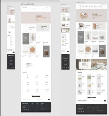
Open the project created in a design tool (e.g., Figma):
Figma: link.
Based on the tasks completed so far, create a responsive implementation of the following homepage fragment for mobile devices and desktops:
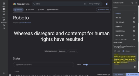
The font Roboto used on the site can be found at:
link
To access the full version of the Figma file:
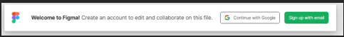
Click Continue with Google, then use your MS Teams credentials (this is also your Google account).
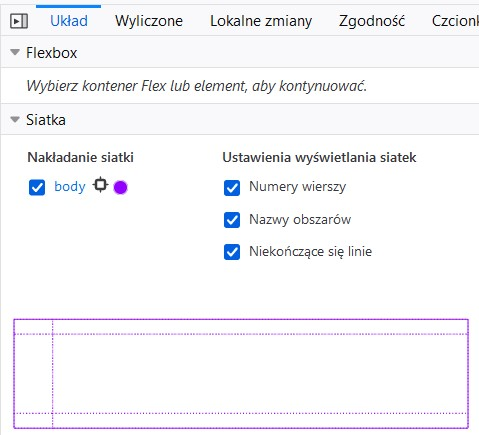
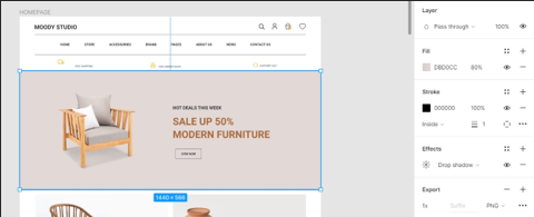
For example, to determine the exact color scheme, click an element:
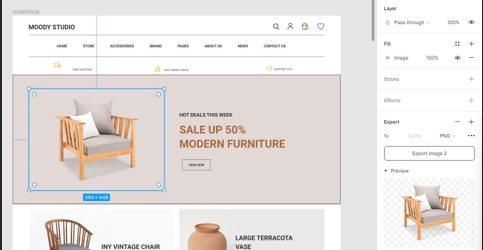
If you are interested in an image, press Ctrl and click on the element:
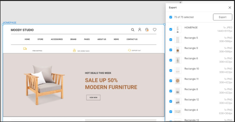
A useful shortcut is Ctrl+Shift+E (to export all assets):
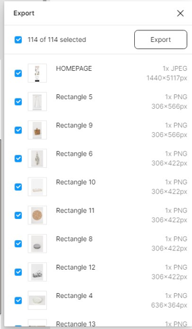
If you use it by clicking on a frame: